Stars
For my inaugural blog post, I figured I may as well start with something about the site itself. Yes, this blog will eventually focus on the trials and tribulations of bringing a video game to market, but I thought an initial detour into a technical aspect of the website's design might be a fun way to kick things off. I admit I may have a skewed definition of the word "fun."
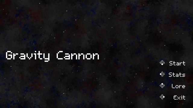
In Gravity Cannon, from the moment you start the game, you are greeted with a twinkling starfield sat on top of a faint pixel art galaxy background. I spent quite a bit of time on the effect and am generally very happy with how it turned out. The star positions regenerate every time the game starts up, and while the change from playthrough to playthrough is probably barely noticeable, I think the result is a game that feels more alive.
I thought it might be neat to recreate this effect to some extent on the scribble tea site. After a bit of research, I found my starting point - a CodePen by @ethancopping called "Dynamic Star Background with CSS and JavaScript." I brought the script and CSS into the site, and suddenly we had stars! But, while I was happy to have found something workable, there was quite a bit more to be done to approach the look and feel of the starfield in Gravity Cannon.
The first significant change I made was to remove the styled <div> rectangles the original script generated and replace them with <img> elements. The source for the images is a single SVG file, converted from the PNG used in the game. Given the scaled SVG is quite a bit larger than the <div> elements used in the CodePen, I reduced the density of stars to reduce clutter.
Next, I adjusted the startup behavior of the script. I noticed the CodePen has all stars appear maximally opaque at the start and then fade randomly. I instead wanted a subtler effect, something that gave the impression the stars have always been there. I accomplished this by providing each star with a random negative animation delay, which simulates each star having "started" twinkling at a random time prior to page load:
const pulseDuration = 4 + Math.random() * 8;
star.style.animation = `${pulseDuration}s infinite alternate pulse`;
star.style.animationDelay = `${-Math.random() * pulseDuration}s`;
And the pulse animation in the CSS:
@keyframes pulse {
    0%,
    80% {
        opacity: 0.25;
    }
    100% {
        opacity: 1;
    }
}
Finally, I worked up a solution for adjusting colors. In Gravity Cannon, each star is tinted by a random RGB value, and this is what gives the very flat 2D pixel art a sense of depth. To recreate this effect on the site, I would have to either hack into the SVG file and make some changes or else tint the stars via CSS filter. I opted for the latter, and the approach I stumbled upon to achieve this is an interesting one. Because the colors in the SVG file are white and gray, I can't hue-rotate them directly. Instead, I first apply a brightness filter and then a sepia filter, which together give the SVG some tint. Then, I can apply a random hue-rotate to each star:
star.style.filter = `brightness(75%) sepia(1) hue-rotate(${Math.random() * 360}deg)`;I realized after adding the chained filters that I might need to adjust the brightness value to different levels across the site, and so I provided a way to read that value into the script as a parameter:
let brightness = document.currentScript.getAttribute("brightness") || "75%";And now I can call the script like so to set the brightness level:
<script src="stars.js" brightness="25%"></script>And voilà! We now have a starfield with both depth and adjustable brightness. While the effect doesn't perfectly replicate what I was able to accomplish in the game, it's a fitting homage, I think, and one that I'm proud to showcase on the site. I hope it brings others as much joy as it has myself.
For those interested, here is the full script:
// Originally based on https://codepen.io/ethancopping/pen/mdaxdEj

let resizeTimeout;
let brightness = document.currentScript.getAttribute("brightness") || "75%";

document.addEventListener("DOMContentLoaded", function () {
  placeRandomStars();

  window.addEventListener("resize", onWindowResize);
});

function onWindowResize() {
  adjustStarPositions();
  clearTimeout(resizeTimeout);
  resizeTimeout = setTimeout(function () {
    removeExistingStars();
    placeRandomStars();
  }, 500);
}

function placeRandomStars() {
  // Pixel density: 1 star per 10000 pixels
  const pixelDensity = 10000;

  const bodyWidth = window.innerWidth - 6;
  const bodyHeight = window.innerHeight - 6;

  const totalPixels = bodyWidth * bodyHeight;

  const numberOfStars = Math.floor(totalPixels / pixelDensity);

  for (let i = 0; i < numberOfStars; i++) {
    const star = document.createElement("img");
    star.classList.add("star");
    star.src = "/images/star.svg";

    const randomX = Math.floor(Math.random() * bodyWidth);
    const randomY = Math.floor(Math.random() * bodyHeight);

    star.dataset.percentX = randomX / bodyWidth;
    star.dataset.percentY = randomY / bodyHeight;

    star.style.left = `${randomX}px`;
    star.style.top = `${randomY}px`;

    const pulseDuration = 4 + Math.random() * 8;
    star.style.animation = `${pulseDuration}s infinite alternate pulse`;
    star.style.animationDelay = `${-Math.random() * pulseDuration}s`;
    star.style.filter = `brightness(${brightness}) sepia(1) hue-rotate(${Math.random() * 360}deg)`;
    star.alt = "";

    document.body.appendChild(star);

    void star.offsetWidth;
  }
}

function adjustStarPositions() {
  const bodyWidth = window.innerWidth - 6;
  const bodyHeight = window.innerHeight - 6;

  const existingStars = document.querySelectorAll(".star");
  existingStars.forEach((star) => {
    const adjustedX = star.dataset.percentX * bodyWidth;
    const adjustedY = star.dataset.percentY * bodyHeight;

    star.style.left = `${adjustedX}px`;
    star.style.top = `${adjustedY}px`;
  });
}

function removeExistingStars() {
  const existingStars = document.querySelectorAll(".star");
  existingStars.forEach((star) => {
    document.body.removeChild(star);
  });
}
And the relevant CSS:
.star {
    position: fixed;
    height: 6px;
    opacity: 0.25;
    z-index: -1;
}

@keyframes pulse {
    0%,
    80% {
        opacity: 0.25;
    }
    100% {
        opacity: 1;
    }
}